Kicking off High Quality Game UX/UI
Rapid concept exploration, building better foundations
Overview
Our team was initially formed to create new intellectual property with premium AAA quality standards for Amazon. Not only were we tasked with raising the bar for 1P development, we needed to create processes to ensure we could build quickly and frugally.
Role
UX Director with hands-on UX, visual design, prototyping, and implementation
Goals
Establish precise definitions for quality levels (LOQ) and a co-development partner who raises the bar.
Create collaborative approaches that decrease budgets and accelerate timelines.
Deliver a look book with first playable implementation in-engine!
Tools
Figma, Creative Suite, Unreal 5.1
Team
3 Vendor teams, each consisting of 1 UX Designer, 1 Visual Designer, and 1 Technical Designer
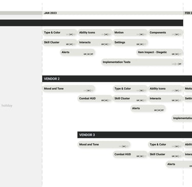
Timeline
First 3 months of a 24 month project
The timeline ...
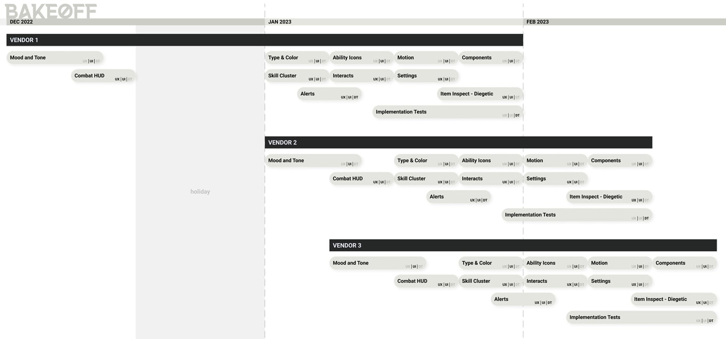
The Approach
To maximize our short pre-production window, I found three highly capable vendors, each with their own strengths and specialties. Working from a shared creative brief, I ran a staggered start "bake-off". Each vendor had 6-8 weeks to create a look-book of common essentials while exploring as many different visual styles as possible. I created a grading rubric and ran reviews with our Creative Director, Art Director, and Publishing organizations to determine the winner.
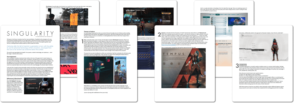
Below is a representative brief I put together for a prior project ...
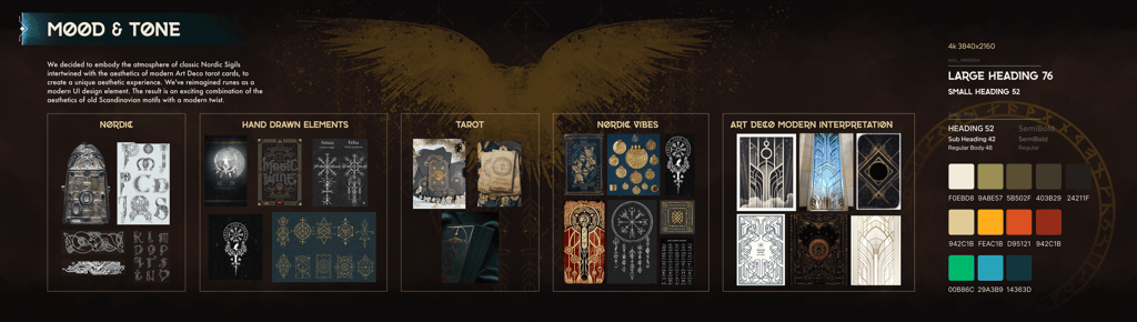
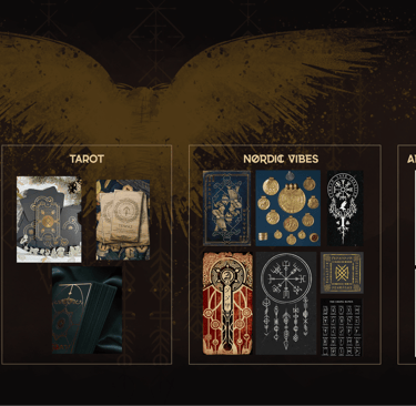
Mild to Wild
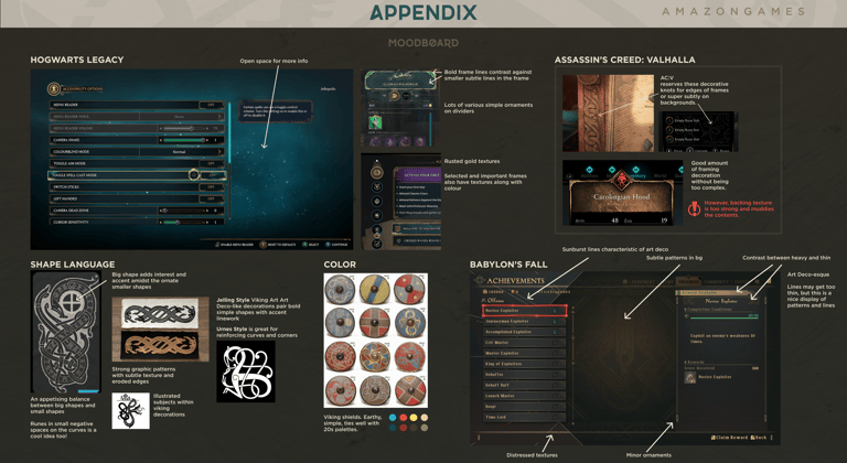
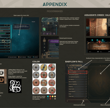
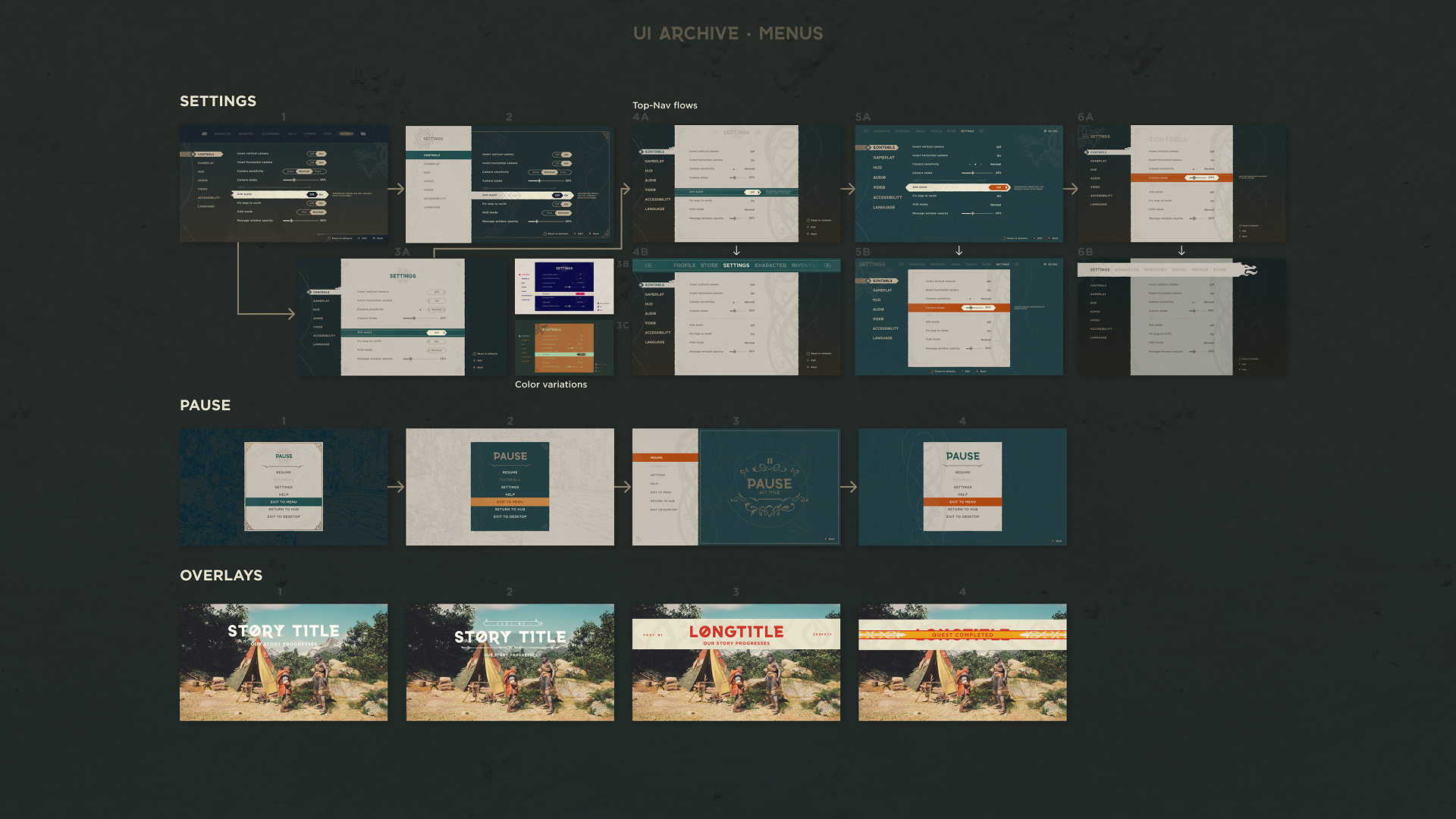
The brief established a common origin but divergent thinking is crucial at the beginning of a project, so I let each group explore shape language and design primitives as we co-created in Figma and AfterEffects. The following images demonstrate the breadth and depth of exploration achieved during these compressed design swarms.
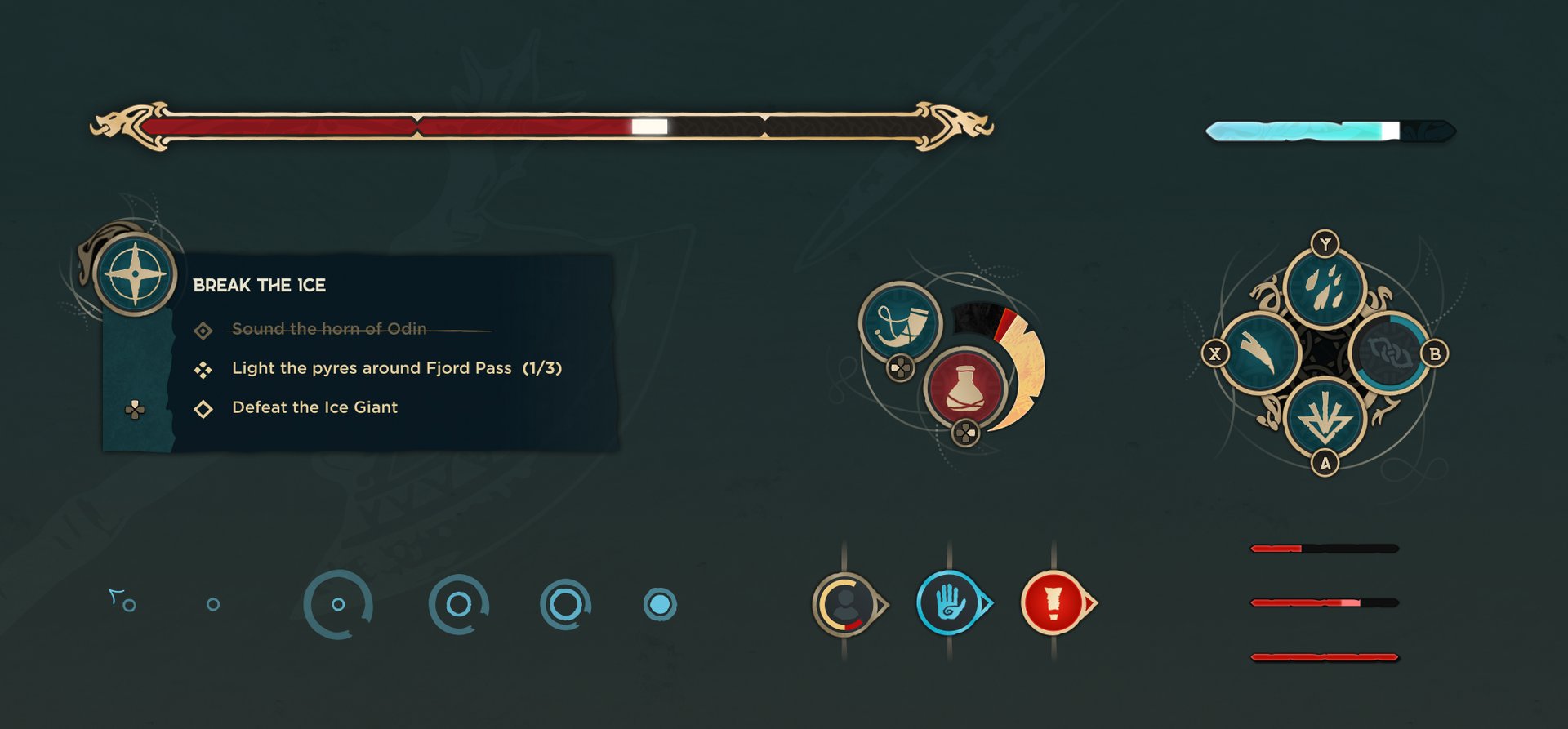
Heads Up
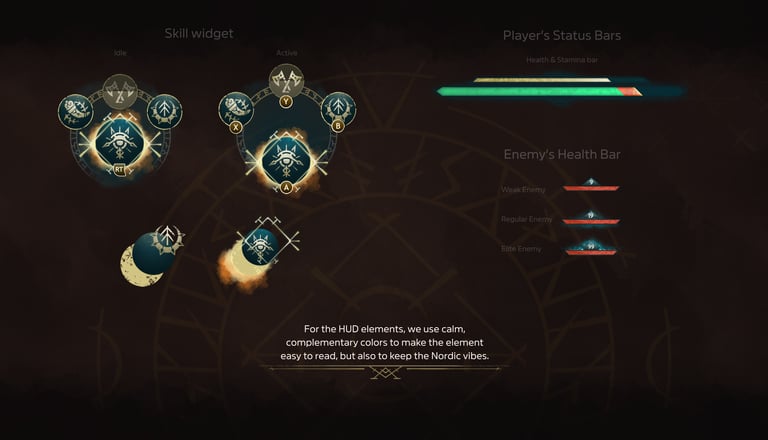
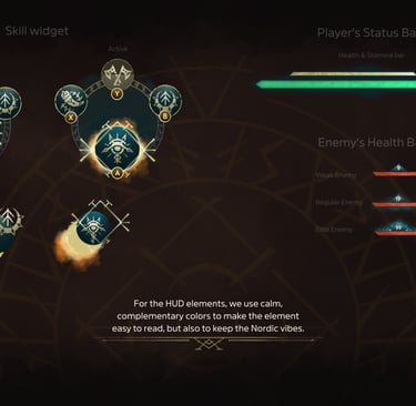
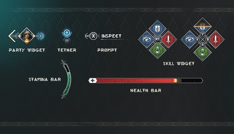
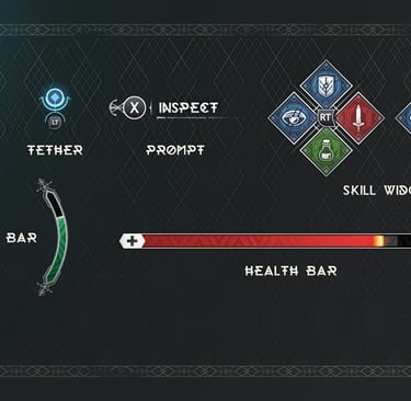
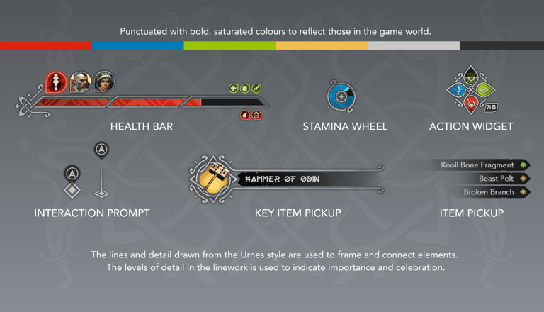
Moment to moment game readouts like skill clusters, player vitals, and mission logs are essential touchstones of visual style and essential to supporting the game team's development and iteration cycles. These kinds of widgets helped us establish conventions for shape language, pattern density, color, and type proportions by deliberately exploring variation in angular and organic shapes and detail levels.
Alert, Alert!
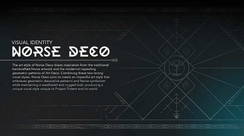
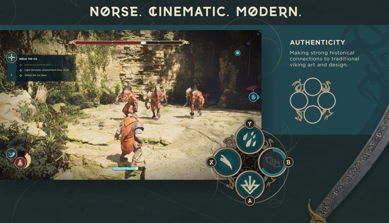
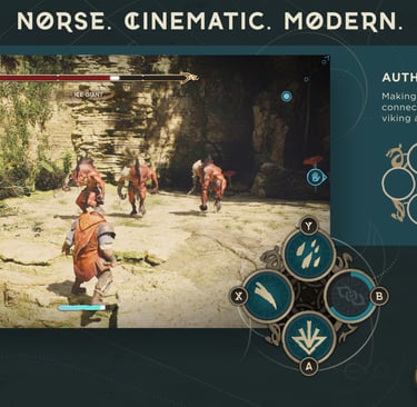
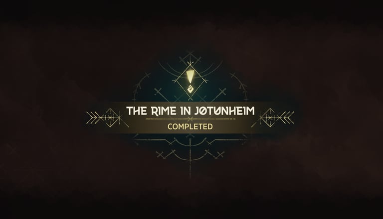
As the different shape languages evolved, we pressure-tested shape primitives in new contexts. We were also examining the extent to which our inventory should be influenced by runes compared to dragon motifs. In the end, our style must be distinctly recognizable as our own, evoking Norse aesthetic but still clean and legible for a multi-player action game.
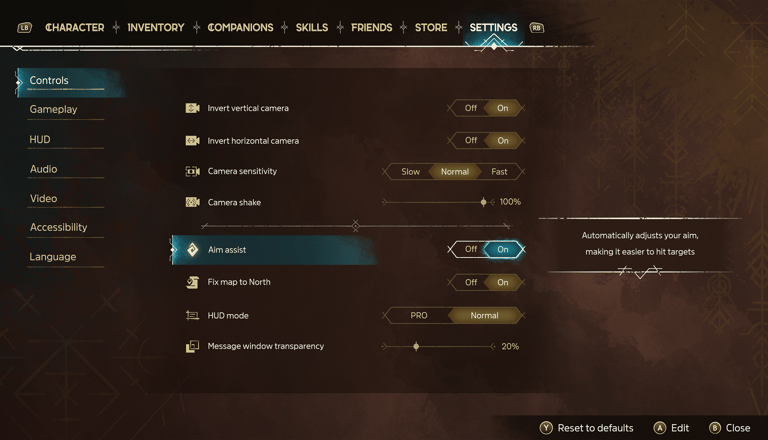
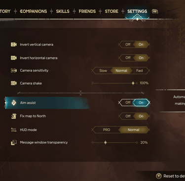
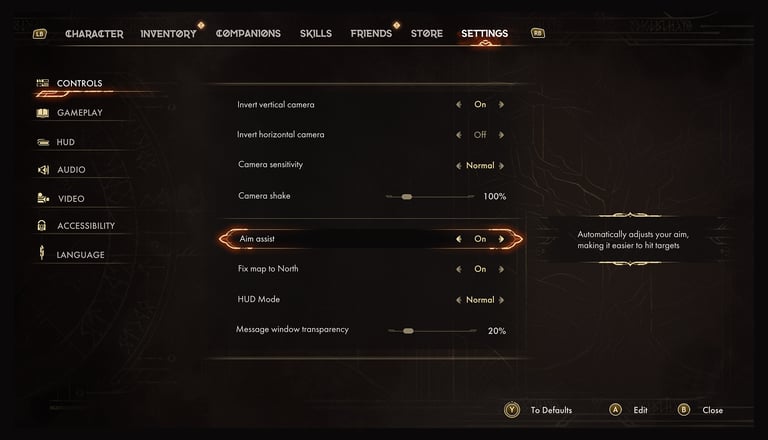
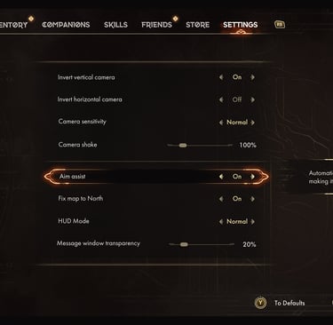
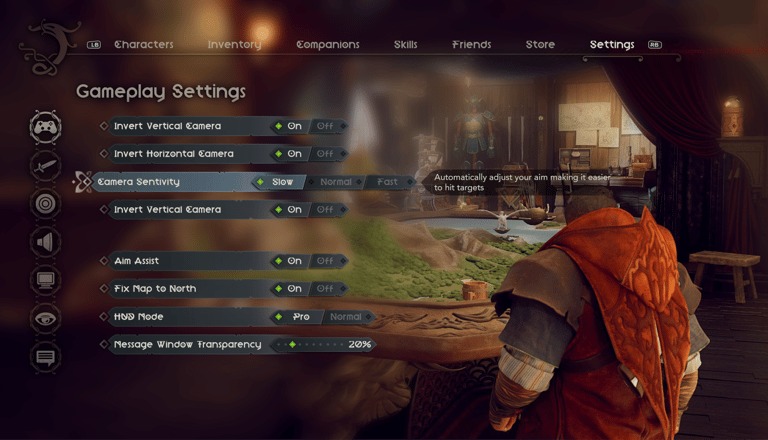
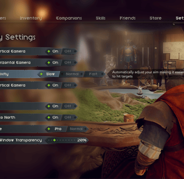
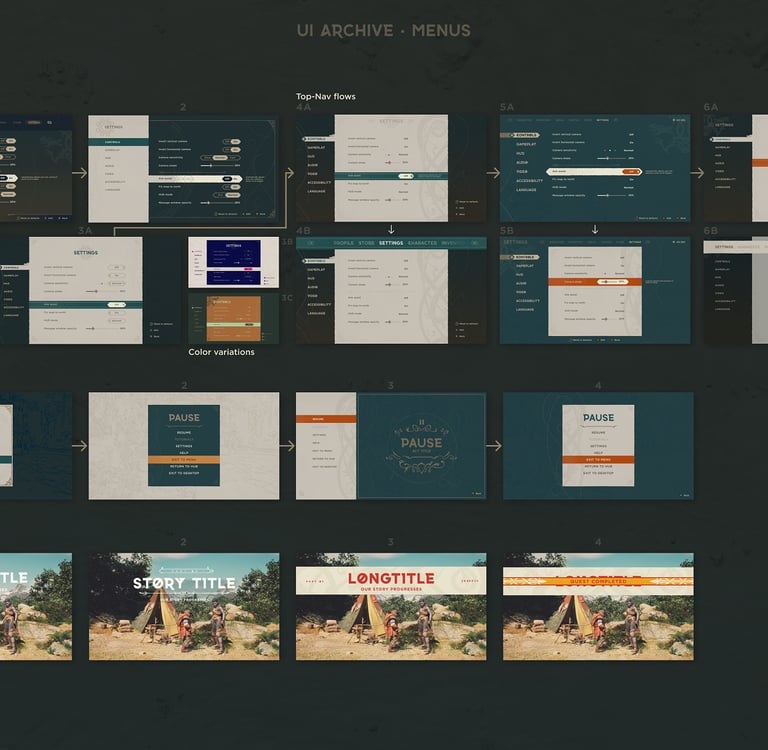
Settings
Continuing the theme of pressure testing shapes and patterns in different contexts, settings screens are excellent test beds for common UI components like list items, tabular navigation, switches, drop downs, dividers, highlight states and buttons. I worked with each team to experiment with different combinations of typography and iconography.
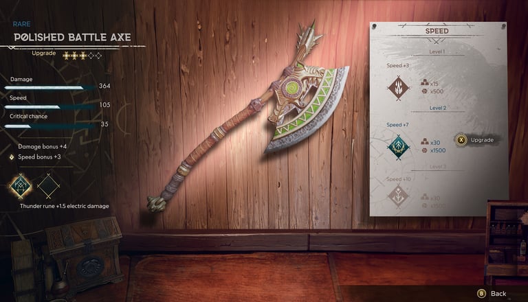
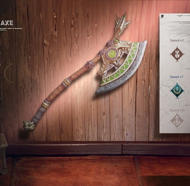
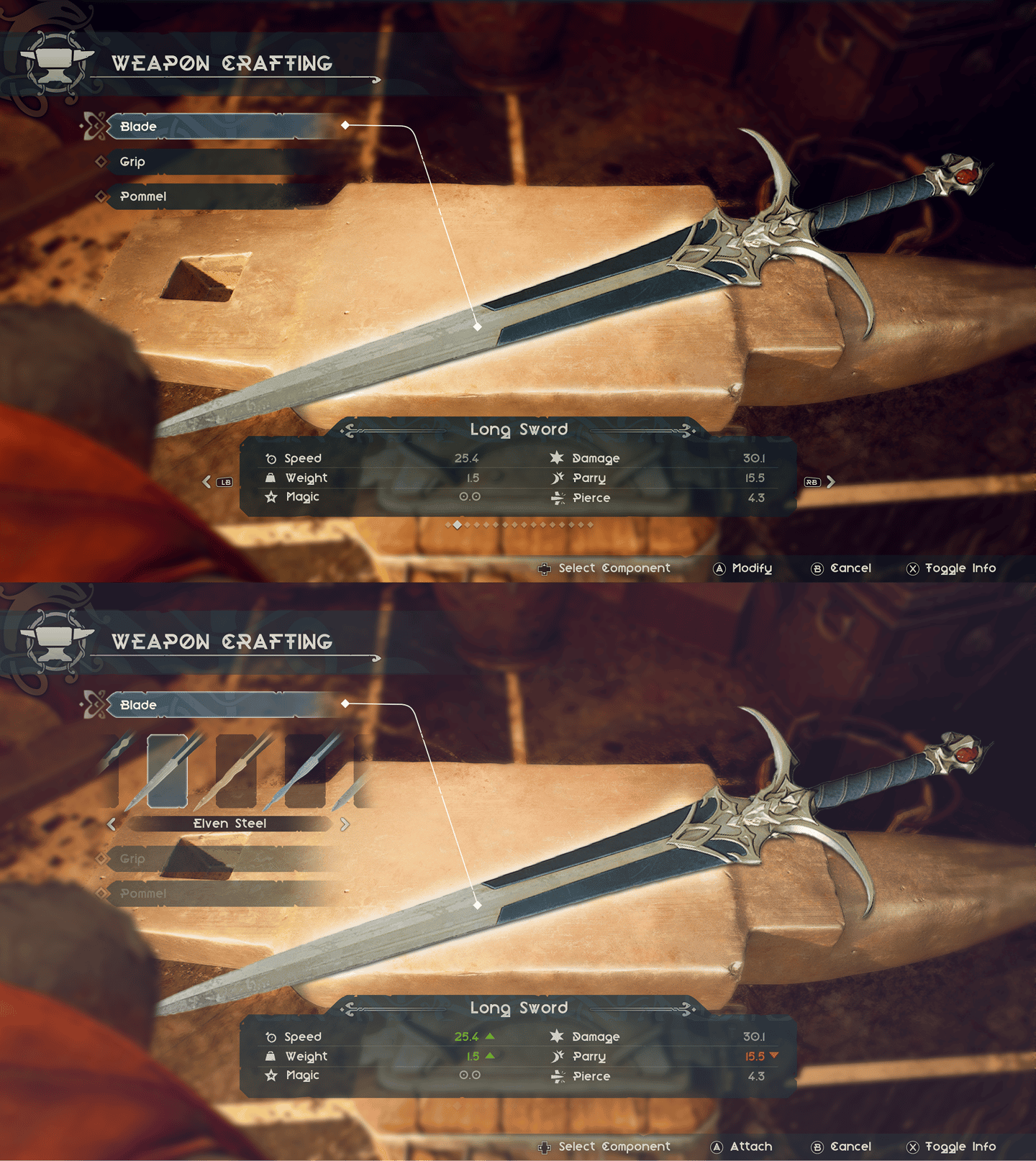
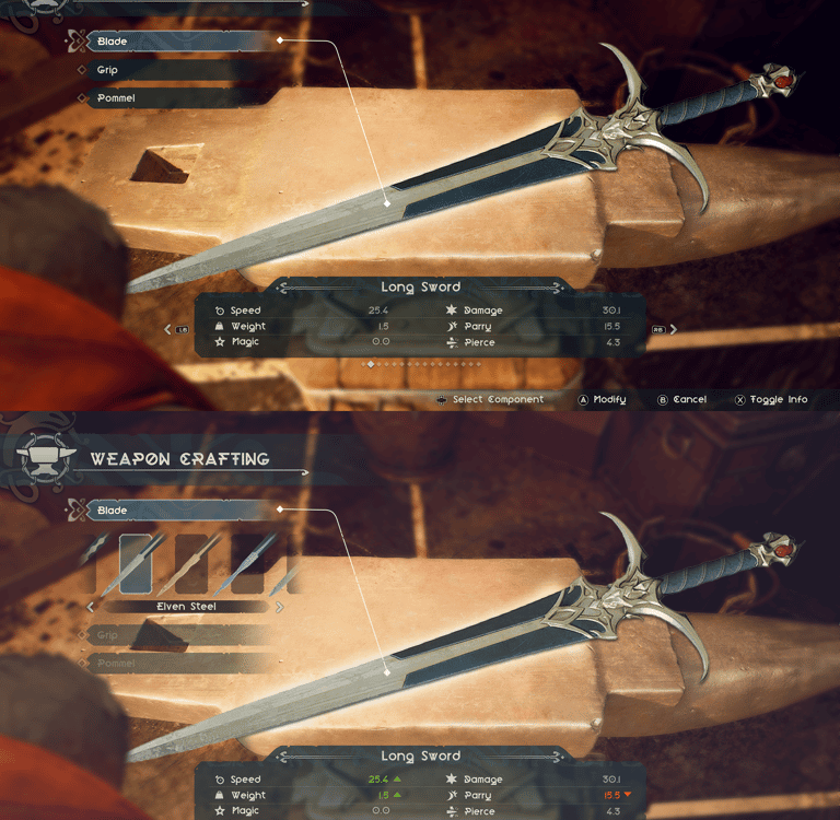
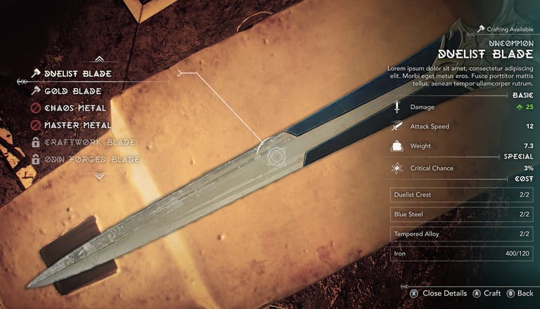
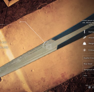
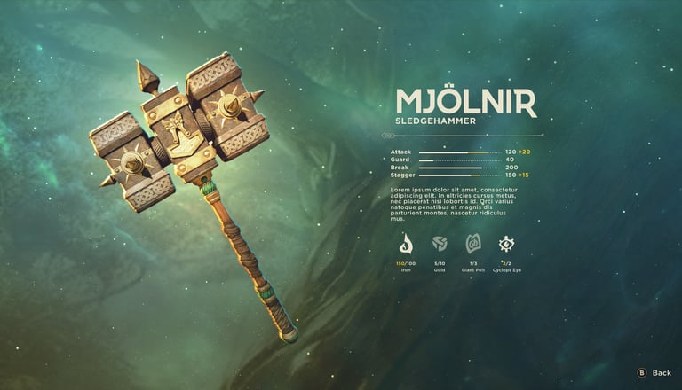
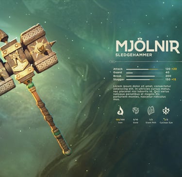
Weapon Inspect
The final exercise, the cherry on top of the bake-off if you will, was exploring different ways that players might interact with physical objects in the world. These explorations allowed us to validate our assumptions about balancing information with world objects.
Results
We saw tremendous talent across the board, but UX is Fine offered the perfect blend of design thinking and technical execution. They didn't just deliver to the creative brief; they became an extension of our team. Their foundational strength gave us the flexibility to pivot* when needed, freeing me up to lead our natural language strategy while they handled core features—like moment-to-moment combat feedback and character creation—under my strategic oversight.
*During the next 18 months we faced no less than 3 substantial creative pivots which changed the game mechanics, overall art direction, fundamental tone, and narrative structure. And our bake-off process ensured that we worked with a partner that not only embraced change but understood how to progress with the highest fidelity output at all times.
note: this interactive scorecard was created in Figma Make to represent the scorecard used during the evaluation period.